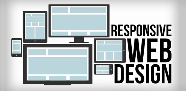
Showcasing your businesses website throughout the vast spectrum of advertising mediums and devices can be a difficult and costly experience. When you use responsive web design, you can reach all of your customers and your potential customers from one website that can be accessible from any device.
Responsive web design presents your website content properly based on a device’s screen resolution size, giving the user a great experience rather than that of a non-responsive website where zooming in and out and manipulating the page can be tiresome and annoying.
When using responsive web design your website is carefully thought out providing the best possible presentation viewable on any device. Consisting of a mix of flexible grids and layouts, images and the use of queries sent from the internet browser to determine the screen size, a responsive website will automatically respond and change giving the best visual presentation of the website possible.
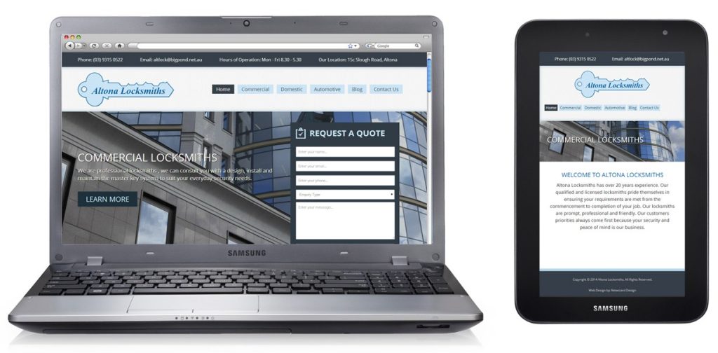
For example, a user could switch from their 15.6″ laptop that has a 1366×768 screen resolution to a Galaxy Tab 7″ that has a resolution of 1024×600 the website will automatically switch to accommodate for resolution, changing image, grid and font sizes. In other words, the website will have the technology to automatically respond to the user’s preferences eliminating the need for a different design and development of a website version for all the various devices and screen resolutions on the market.
The obvious benefits of a website developed using responsive technology is being less expensive to launch as it is ready for any device you throw at it. No need to build a mobile version of your website or building individual apps for Apple or Android devices. A single responsive website is all you need to reach the unlimited potential customers waiting for find you and your services and products. Contact Netwizard Design today to discuss how we can help.